A tenuous pun at best, but whatever. Continuing where the last post left off let's get on with the next installment of DOOM minis, shall we?
Mancubi are, without a doubt, my absolute favorite monster in the DOOM boardgame. They're just so cuddly and adorable don't you think? Just because he has plasma cannons for hands doesn't mean he doesn't want a hug.
Colour scheme wise they're pretty straightforward. Rotten flesh and drybrushed silver for the mechanical elements.
Ah, the Archvile. These guys were a little trickier. The thing about Archviles is they're rather meant to be on fire. So whilst the base is pretty much the same as the Imps you need to layer on some reds and yellows over the top to try and make it look like they're lighting up.
I'm not entirely sure how successful I was in this. However I quickly found that in the cases where it didn't entirely look firey it certainly looked like a bloody pus drenched hideous corpse. Which, in context, is really no bad thing.
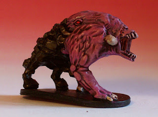
Then there's the Demons. Which have changed a bot from the original Doom, haven't they. However they're still going to be PINK.
You can easily spot the first one I did, as he's a lot paler. I decided I wanted them to pinker after I'd done the first one. Basically with all of these I'd start by painting one, figuring out how to do it as I go, and then move on to painting the rest in a group.
The Cyberdemon. Whilst the basic colour scheme isn't overly complicated the challenge here was the size of the pieces. These boys are BIG.
Flesh and metal are the order of the day, with a brown/black ink wash I think. Lot's of drybrushing to get the colour of the metal suitably dark. If there's one thing I really learned whilst painting the Doom minis it's that you really don't need to use expansive pallets on any one piece. Which is handy when you've only got one type of silver to hand.
Lastly we have the Marines. Indeed, it was these and the Cyberdemons that I did last of all. Wanting to work up to them. The bosses and the heroes need to be good after all.
I suppose they're pretty straightfoward really. The only difference being the colour of armour between the various sets. Again I've used a black/brown ink wash. In addition to the shading this gives them a rather grimy quality, which I think works quite well. I suppose if I'd had a proper flesh wash I might have used that, but they'd have come out a lot cleaner looking, and I'm not sure that would have worked as well.
I guess the only real problem is that the blue and green marines aren't as immediately distinguishable as I'd perhaps have liked. But the only real way around that would be to redo them in much brighter coloured armour.


No comments:
Post a Comment